Android 16 is getting colorful with new design
Google is adding more color and visual personality to Android 16, reports Wylsa.com.
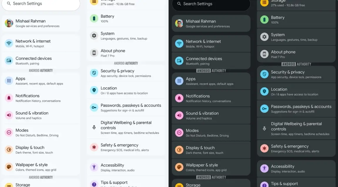
In the latest beta version, journalists spotted a revamped UI using Material Design 3 Expressive, a design language with vibrant, section-specific colors. The settings menu now resembles ColorOS, known from OPPO and OnePlus devices.
Each settings icon has its own color, bringing life to the traditionally gray Android interface — except for “Digital Wellbeing”, which remains in its dull grey.
Users are now hoping for more freedom — like removing the fixed Google search bar from the home screen and a more user-friendly notification shade. Borrowing design ideas from ColorOS wouldn’t be shameful at this point.
Google is expected to officially reveal these updates during the Google I/O conference on May 20.
Add Zamin.uz to GoogleRead "Zamin" on Telegram!In the latest beta version, journalists spotted a revamped UI using Material Design 3 Expressive, a design language with vibrant, section-specific colors. The settings menu now resembles ColorOS, known from OPPO and OnePlus devices.
Each settings icon has its own color, bringing life to the traditionally gray Android interface — except for “Digital Wellbeing”, which remains in its dull grey.
Users are now hoping for more freedom — like removing the fixed Google search bar from the home screen and a more user-friendly notification shade. Borrowing design ideas from ColorOS wouldn’t be shameful at this point.
Google is expected to officially reveal these updates during the Google I/O conference on May 20.


Comments 0
…