The renewal of the Marseille logo has been criticized by fans
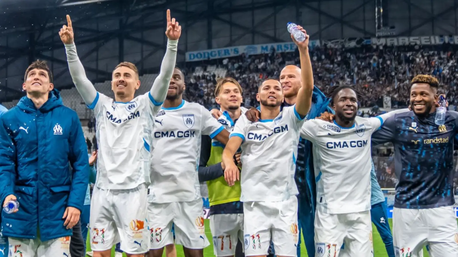
The famous French club Olympique Marseille decided to change the logo design in order to renew its brand. However, this initiative was not received as warmly as expected and caused sharp criticism from fans.
As it turned out, the process of working on the new logo was carried out with a rather serious and thorough approach. An official application for the project was submitted to the French National Institute of Industry in May 2025. After a year of work, a new version in the Art Deco style was developed, and its official presentation was scheduled for April 8.
However, before the presentation, the logo spread on social networks and was met with strong criticism from fans. In particular, many did not like the modern style of the design.
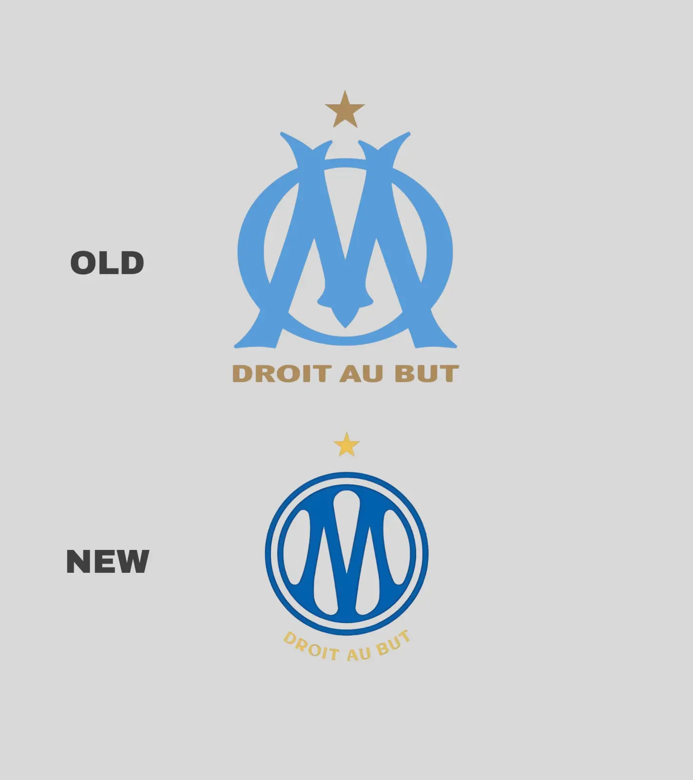
Interestingly, the agency that worked on the rebranding claimed that it was inspired by famous car brands such as Peugeot and Citroen when creating the new logo. This further increased the discontent of the fans.
“We are a football club, not a car dealer,” the idea spread widely on social networks. Many fans, remembering the golden era of the club, especially during the years under the leadership of Bernard Tapie, are demanding the return of the traditional logo.
Thus, this rebranding can be a big lesson for the management of Marseille. Because in football, not only results, but also traditions and symbols are very important for the fans.


Comments 0
…