


Will it be hard to get used to? Instagram’s new logo and the debate online
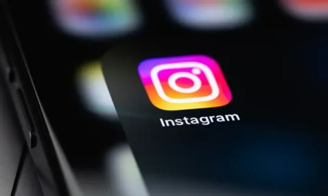
The world’s most popular photo and video-sharing service — Instagram has fundamentally redesigned its official text logo, or wordmark, for the first time after nearly a decade.
The social network’s unexpected visual redesign directly affected the service name’s branded lettering.
The handwritten style remains, but the geometry has changed
Designers fully preserved the network’s familiar classic handwritten foundation while extensively refining individual letter elements. In the new version, the letters look more precise, geometrically refined, and modern.
Meta says this step was intended to preserve the new logo’s visual and historical connection with Instagram’s previous corporate brand identity.
Notably, the update applies specifically to the “Instagram” wordmark, while the familiar gradient icon featuring a camera remains unchanged.
Strong user reactions and heated discussions
The update to Instagram’s logo immediately sparked heated debate among the social network’s users.
Because the previous wordmark had remained unchanged for nearly 10 years, many people are struggling to get used to the new design. Some in the audience praised its modern geometry as positive and minimalist, while others found the new lettering unfamiliar and began comparing the shapes of certain letters with other symbols.
Share your opinion in the comments and send the article to your contacts via Telegram or other social networks.



Comments 0
…